Hey there…
I’m Hailey Adams, a Brand Designer with nearly 15 years of experience in both agency and in-house settings. I specialize in creating scalable, on-brand designs that are visually engaging, easy to understand, and aligned with project strategy. With a strong focus on detail and collaboration, I design everything from packaging and page layouts to environmental and event design, guiding projects from concept to completion.
Each year a suite of four chocolate bars are produced for the attendees — the superheroes that visit San Diego for the largest convention of the year!
The chocolate bar packaging is one of my all-time favorite projects. It’s allows for so much creativity and satisfaction from seeing the excitement these bars bring to so many fans from around the world.
Challenge: Create a memorable take away for an event that already offers tons of memorabilia while keeping in theme with the event. Design vibrant, comic-themed packaging without infringing on any pop-culture copyrights.
Solution: A suite of chocolate bar packaging that sells out every year, no matter how many bars are created (10,000 of each bar in 2024). The fans go wild to get their hands on these limited edition chocolate bars that are brought to life through creative, unique, timely and fun packaging.
2019 Chocolate Bar Suite
Stranger Smores
50/30 Bar
Dragon Smoke
Battle Bar
2019 Chocolate Bar Suite; Fun Facts Brochure; Employee Commemorative Button
2020 Special Edition Chocolate Bar, Saturday Morning Cartoons
2022 Chocolate Bar Suite
Sunrise S’mores
Pixie’s Garden
Misunderstood Villain
Recess
2024 Chocolate Bar Suite and first ever Collector’s Box
*I designed the Collector’s Box and lead creative direction of packaging design. Wrappers and photography were done by colleagues.
Collector’s Box and Chocolate Bar Suite
*I designed the Collector’s Box and lead creative direction of packaging design. Wrappers and photography were done by colleagues.
Collector’s Boxes being sold at the chocolate booth
*I designed the Collector’s Box and lead creative direction of packaging design. Wrappers and photography were done by colleagues.
A milestone year calls for a milestone celebration.
Challenge: Honor the employees and bring the building to life by celebrating 30 years of success in the community.
Solution: A campaign featuring an art exhibit unveiled at a celebratory luncheon for employees, city officials, and clients, along with support pieces to expand into the community.
Collaboration was key in this campaign! As the lead designer, I applied project management skills to outline and delegate each piece of the campaign. The art exhibit was executed through the design of a 10’ x 6’ installation showcasing employee stories and sharing with the community how they have brought the building to life over the span of 30 years.
The life-size art exhibit later went on to live at the San Diego International Airport for two months where it was shared with visitors arriving from around the world. In addition, a special section spread was featured in the San Diego Union Tribune to share the staff stories and successes with the community.
Full campaign deliverables included:
• Two life-size art exhibit walls
• One interactive experience display
• Life-size “Gather” Instagrammable word art
• Commemorative coins
• Special section featured in the local newspaper
• Community Holiday Celebration Event - evites, social media campaigns, event design support
Who doesn’t love chocolate? We enjoy thanking our guests with chocolate.
Challenge: Design unique packaging for annual signature bars, representing the brand and region.
Solution: Through color, typography, and “San Diego” elements, layouts and patterns were created to highlight key ingredients in the signature bars.
For 2021, our focus shifted to a theme rather than ingredients. After more than a full year of keeping our distance, it was sweet to design the 2021 Signature Bar to celebrate the venue’s reopening. The vivid colors and beach theme link the bar to the desirable location of San Diego and the play on words ties into the bright times that lie ahead.
2019 Signature Bar
2020 Signature Bar
2021 Signature Bar
Front and back of the 2021 Signature Bar
San Diego has so much to offer! An annual magazine was produced to help visitors navigate the city and get the most out of their visit.
Challenge: Promote the city through highlights and must-see features in a 100+ page magazine.
Solution: A fun and playful feel helps break down the best of the city in an engaging yet easy to digest way. The magazine features neighborhoods, beaches, restaurants and attractions. Organization is key along with the use of color, typography, and imagery to bring each page to life. A cohesive feel relies on plenty of diversity from page to page, while the maintaining a consistent style throughout.
Magazine Overview
Custom designed neighborhoods map
Coronado and Little Italy features
Beaches feature
Beaches feature with map
Restaurant feature
Play feature
Attractions feature
Challenge: The project started with a call for submissions of possible safety slogans from employees, followed by safety committee review and employee voting on the slogan finalists.
Solution: The slogan was designed on-brand via use of color and a comic-style approach, tying into the team’s pride as the longtime home of Comic-Con. Keeping safety top of mind and bringing life to the security base at the San Diego Convention Center, a 10-foot mural was installed in a busy corridor. Previously a white brick wall, the design livens the space while displaying an important message to the many workers who travel the corridor using forklifts, electric carts, and equipment.
The wall was painted and the mural was applied via alumni graphic rolls, allowing the texture of the brick wall to show through. Most importantly, the graphic reminder has contributed to increased awareness of our safety program, helping all to return home safely.
The design was then edited and scaled to be used as a banner on safety emails, meeting agendas, and other digital uses.
Safety slogan design
Safety mural
Safety mural wall application mock-up
Safety slogan header
Meeting agenda
Annual Reports -- becoming a thing of the past, or an opportunity to innovate and tell your story? When done well, annual reports are a great way to share your story with your community, stakeholders and clients.
Challenge: Translate a year’s worth of events and financials into a digestible report.
Solution: Group content into sections that flow from page to page. Highlight events and financials through use of imagery, color, data visualization, and pull quotes.
As lead designer, I received an Honorable Mention from the International Design Awards 2019 for the FY2018 Annual Report.
FY2019 Annual Report
FY2019 report cover; regional impact path; ROI stats
FY2018 Annual Report
FY2018 report cover; top 10 events
FY2020 Annual Report cover and Mayor’s quote
FY2020 Shelter to Home, pandemic emergency use
FY2021 Annual Report cover, Operation Artemis - sheltering unaccompanied minors during the pandemic pivot
FY2022 Annual Report Cover, event highlights, and regional impact
FY2023 Annual Report cover, record-breaking year, and top events
This project is from 2014. Why am I telling you that? Well, when I designed the look of this campaign I wanted it to be elegant and timeless; and it’s just that. So yes, all these of years later, I am still feeling this design. Mission accomplished!
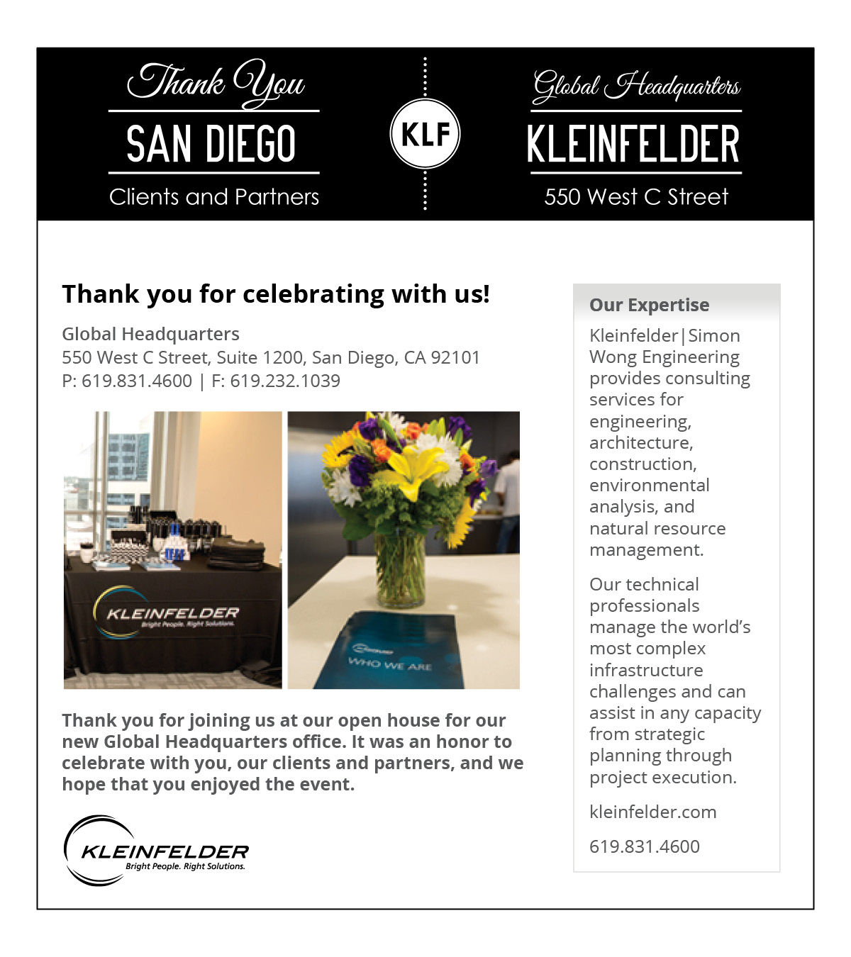
Challenge: Event promotion through development of a unique invitation, landing page, eblast, and signage, all which is scalable for multiple events.
Solution: The look and feel of the event was design to be easily scaled for three separate events — San Diego, CA; Riverside, CA; and Denver, CO. The invitation organizes a lot of information in a modern, classic style, making it easy to grasp. The microsite, eblast, and signage compliment the look and feel of the invitation.
In addition to design, I provided event coordination - tracking RSVPs, registration, and attendance records; organizing and training event volunteers; mapping the layout of the event; ordering of giveaways; and directing set-up and clean-up crews.
Event invitation and signage
Tiered invitation
Single pages of invitation
Event landing page
Ebalst invite
Thank You Eblast
Event signage
Event Signage
Maps are a great way to communicate a lot of information in a straight forward, visually appealing way. The maps shown here were created for a variety of projects and mediums -- some posted to websites, and others printed on large presentation boards.
With an eye-catching cover page, this case study is inviting. The layout lends itself to featured photos and key project information while maintaining a good balance between photos and text.
Branded swag—who says it has to be boring? The days of handing out plain items with basic logos are over. Let’s get creative and have some fun while showcasing the brand!
Tote Bag: Everyone loves a good tote bag!
Challenge: Design a branded tote bag that showcases highlights of the convention center and San Diego. The bag will be distributed to new hires and special guests.
Solution: I created a dynamic word art design featuring key words and phrases that celebrate both the convention center and San Diego. The layout forms an engaging pattern, and when paired with the logo, it results in a stylish, versatile tote. The design highlights key elements of both the location and the brand, making the bag both functional and on-brand.
Frisbee: Every throw is a new adventure!
Challenge: Create branded swag for a summer giveaway.
Solution: Summer is all about bright colors and beach vibes. I embraced the season’s energy by designing a bold, playful frisbee featuring fun, summer-themed illustrations. The result? A piece of swag that’s sure to bring joy and excitement to anyone who catches it!
Versatile, Branded Tote Bag
Summer-themed Frisbee
Challenge: Design an event page for Yoga Under the Sails, a community yoga class in the Sails Pavilion, featuring coordinated lights and music.
Solution: Using event imagery for the winter, and outdoor imagery for the summer, I created a visually engaging event page. By using brand colors and fonts, the design showcased the unique blend of yoga, music, and light, capturing the event’s atmosphere.
Winter Event Page Design
Summer Event Page Design
This coin served as a thank you to all involved in the bridge project. To emphasize the safety of pedestrians, specifically school children, the coin features the bridge, school kids, large road, and the City logo. The original was hand drawn, scanned in, and then shaded to depict the 3D levels at varying heights.